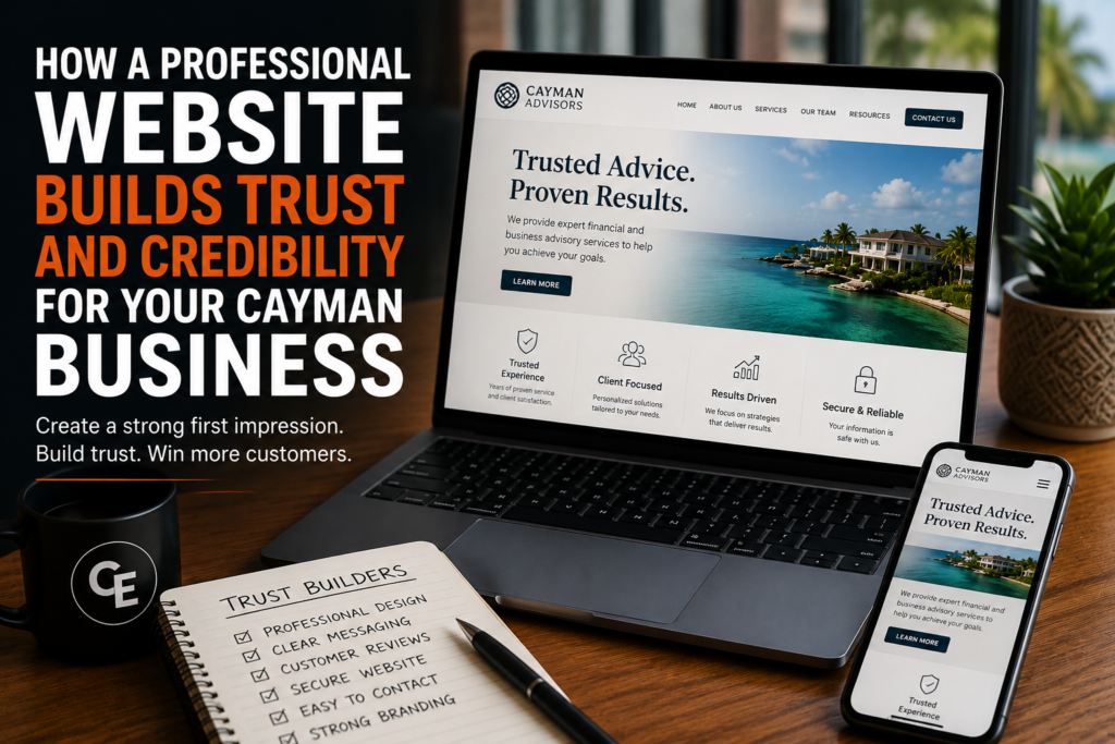
Trust is the thing a website is really selling. Before anyone weighs your price or your turnaround, they are deciding whether you are a real, competent business worth handing money to. That judgement happens fast, and it happens on evidence the visitor may not consciously notice.
Credibility is assembled from small signals
Nobody arrives at a website and consciously scores it. They form an impression from a handful of details: whether it looks current, whether it loads, whether the writing sounds like a person who knows the subject, whether the contact details look like a business rather than a hobby. Individually these are minor. Together they decide whether the enquiry gets sent.
Say what you do plainly
Vagueness reads as evasion. “Solutions for your needs” tells a visitor nothing and makes them wonder what you are avoiding. Naming your services specifically, including the ones you do not offer, is one of the strongest credibility signals available, because only someone who actually does the work can be that particular about it.
Show the work, not adjectives
Claiming to be professional is weaker than looking professional. Detailed service pages, honest photography, clear specifications and straight answers about how things work will do more than a page of superlatives. If a visitor finishes a page knowing more than when they started, you have demonstrated competence rather than asserted it.
Make contact effortless and real
A findable phone number, a working email address on your own domain, and a form that confirms it was sent. An email address on a free consumer domain, or a form that swallows enquiries silently, undermines everything else on the page. If you are a Cayman business, say so, and say where you deliver. People want to know they are dealing with someone local before they commit.
Security is visible now
Browsers tell visitors when a connection is not secure, and the warning is not subtle. A site served over HTTPS is the baseline expectation, not a feature. Anything less, especially on a page with a contact form, actively costs you enquiries.
Consistency across everything you print and publish
A visitor who has seen your vehicle, your storefront sign and your business card arrives with an expectation. If the website uses different colours, a different logo treatment and a different tone, something feels off even when nothing is obviously wrong. Consistency is not vanity; it is the visitor’s evidence that the same organised business is behind all of it.
Keep it current
A site that clearly has not been touched in three years raises the same doubt as an unanswered phone. Prices that are out of date, services you no longer offer, a copyright line from a previous decade. None of it is fatal on its own, but together it suggests nobody is minding the business.
Reassure people about what happens next
Much of the hesitation before sending an enquiry is uncertainty about what follows. Explaining how you quote, what you need from the customer, and what the process looks like removes that friction. People are far more willing to start a conversation when they can see where it leads.
A practical review
Pull up your website and ask, honestly, whether a stranger would conclude this is a real, current, competent business. Check the contact details work. Check the secure padlock is there. Check the branding matches what is on your van. Check the most recent thing on the site is not from two years ago.
Creative Exposure builds websites for Cayman businesses and handles the print and signage alongside them, so the brand a customer meets online is the one they meet in person. If you want a second opinion on what your current site is telling people, send us the address and we will tell you what we see. It is also worth checking it against the ten mistakes that cost businesses customers.