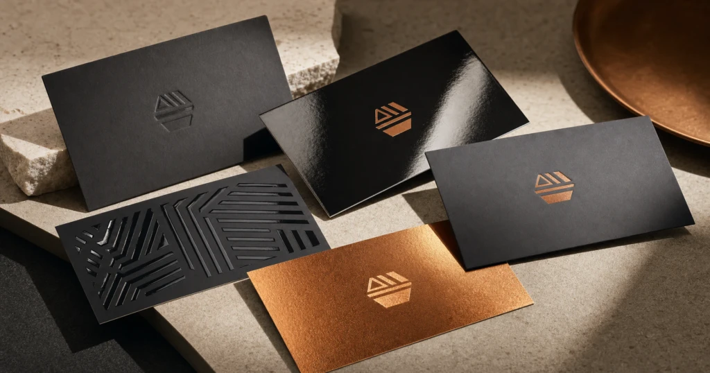
A business card gets a few seconds of attention, usually at a handshake, across a reception desk or at a crowded networking evening, and in that time the person holding it notices more than your name and number. They take in whether the surface is glossy or quiet, whether the card feels flimsy or substantial, and whether the colours look rich or muted. Those impressions come from the paper stock and the coating. This guide explains the business card finishes Creative Exposure offers, how each one looks and feels, and how to choose for the way your cards will actually be used in Cayman.
Start with the paper stock
A coating sits on top of the paper, so choose the stock first. The Business Cards product offers five:
- 14pt C2S (Gloss Cover): a smooth coated stock. C2S means coated two sides. A sensible starting point for everyday cards.
- 16pt C2S (Gloss Cover): the same smooth surface in a thicker card, with a firmer feel in the hand.
- 18pt C1S Gloss Cover: the thickest of the gloss stocks. C1S means coated one side, so the front is coated and the back is uncoated.
- 100# White Linen Cover: a white stock with a fine woven texture, like linen cloth, that you can see and feel.
- 14pt Uncoated Cover: a natural paper surface with no coating and a slight tooth under the fingertip.
The “pt” figure is a thickness measure, so a higher number means a stiffer card. Thickness is often the first thing people notice, before they have read a word.
Coating is chosen separately. If you want linen or uncoated for its natural surface, ask us how the coating options apply to that stock before you order.
The coatings and what they do
Gloss UV on one side or two
UV 1 Side and UV 2 Sides (Super Hi-Gloss Coating) add a clear, very shiny layer that makes colours look deep and saturated and gives the card a slick, glassy feel. It flatters photography and bright brand colours: property images, food shots and anything with a sea-and-sky palette.
Satin AQ matte
Satin AQ 2 Sides (Matte Coating) has a low sheen. Colours look calmer than under gloss, and the surface feels smooth rather than slick. Because it reflects less light, text reads evenly from most angles, which makes it a natural fit for type-led designs, muted palettes and generous white space.
Spot UV
Spot UV 2 Side applies clear gloss only to the areas you choose, such as a logo, a pattern or a name, so those elements catch the light while the rest of the card stays quieter. It is a simple way to turn one element into the hero without adding another colour.
Foil stamped cards in gold or silver
Foil adds gold or silver that shines in a way ink cannot. On the Foil Stamped Business Cards product you choose the foil colour and how the sides are printed:
- 5/0: full colour front with foil, blank back.
- 5/1: full colour front with foil, black and white back.
- 5/4: full colour both sides, foil on one side.
- 5/5: full colour both sides, foil on both.
The number either side of the slash counts the printing colours on that side, with the foil counted as a fifth. Foil looks its best on confident shapes, such as a logo mark, a monogram or a simple border, rather than very small text. Gold tends to sit well with warm palettes, while silver pairs naturally with blues, greys and black.
Rounded corners and the coatings above are options on the standard Business Cards product, so if you want those details together with foil, ask us before you order.
Rounded corners
Corners change the whole outline of a card. You can keep them square or choose a rounded corner at 1/8 in, which softens the edge subtly, or 1/4 in, which is more noticeable and friendlier. Either size can go on all four corners, the top two, the bottom two, or one diagonal pair. All four at 1/8 in is a quiet refinement that works almost anywhere, while a rounded diagonal pair gives a leaf-like outline that suits salons, creative studios and lifestyle brands.
Readability and writability
Reading it in bright light
High gloss reflects light. Hand a gloss card across a table on a sunny Seven Mile Beach terrace, or under bright hall lighting at a Cayman expo, and small text can flash white at some angles. If your card carries several contact lines, a matte or uncoated surface is easier to read at a glance from most angles. On uncoated stock, ink settles into the paper, so colours look a little softer and fine type is best kept at a comfortable size.
Writing on it
Plenty of cards get written on: an appointment time at a clinic, a reference number from a contractor, a mobile number added after a meeting. Pens generally move most easily on uncoated and linen stocks, and on the 18pt C1S stock the back is the uncoated side. High gloss is the least friendly to a ballpoint, so UV 1 Side keeps the shine to one side of the card. Pair a writable back with 4/1 Full Color Front / B&W Back for a clean reverse with room for a few printed lines to fill in. If writing on the card matters, mention it and we will confirm the combination that suits.
Matching the finish to your brand
The finish should sound like your business. For Cayman businesses, a few broad pairings tend to work:
- Bold and colourful: watersports operators, restaurants and retail brands with vivid imagery suit gloss UV.
- Calm and professional: finance, legal, consulting and wellness tend to suit Satin AQ.
- Crafted and traditional: linen gives a textured, tailored feel for established firms and boutique hospitality.
- Natural and approachable: uncoated fits artisan producers, cafes and trades.
- Premium and memorable: Spot UV or foil suits real estate, luxury hospitality and events.
Treat these as starting points rather than rules. A tech start-up can look sharp on linen, and a law firm can carry a single line of silver foil with real restraint.
Everyday cards and premium cards
Everyday working cards, for field teams, front-of-house staff or an expo where you will hand out hundreds, work well on a 14pt or 16pt coated stock with UV 1 Side or Satin AQ and square corners. Presentation cards, for senior staff, client meetings or a launch, can justify the 18pt stock, Spot UV, rounded corners or foil.
Some businesses order both. If you need several versions, tell us how many and the details for each when you request a quote, and we will confirm how the order should be structured. Both card products are priced by quantity with a minimum order of 250, and the price shown is for the whole quantity, updating as you choose each option, so you can compare finishes before you commit.
Setting up artwork for your finish
Business card artwork requires a 0.125 in bleed on all sides, and two-sided cards need the front and back as separate PDF files. Start from the Business Cards artwork template and read our guide on how to prepare artwork for professional printing. For Spot UV or foil, tell us which elements should carry the effect, and if you need help preparing your artwork, please contact us before ordering.
Order your next cards with Creative Exposure
Settled on a look? Open Paper, Labels & Packaging, then try different stocks, coatings and corners on standard cards, or compare gold and silver on foil stamped cards. Our business card printing page sets out ordering, artwork and payment in one place.
Still torn between matte and gloss? Request a business card quote and describe where the cards will be handed out, whether anyone will write on them and the impression they should leave, and we will suggest a stock and finish to suit. You can also email sales@creative.ky or message Creative Exposure on WhatsApp.
Turnaround is 6 to 10 business days from artwork approval, which is worth counting back from before a product launch or a new team member’s first week. Rush work may be available. Please WhatsApp or email us to confirm availability. We deliver across Grand Cayman.